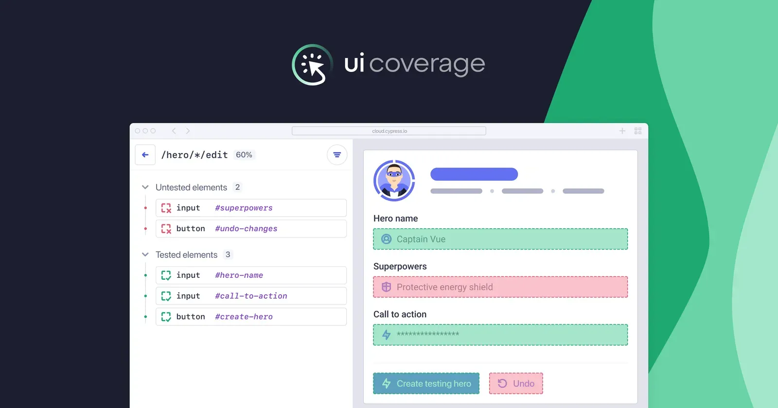
UI Coverage quantifies how well your Cypress tests exercise your application by mapping interactive elements to those actually tested. The resulting insights expose gaps in critical user flows and can power quality gates that can be enforced in CI through our Results API. As a Technical Account Manager with extensive hands-on experience with configuring UI Coverage for users and in close collaboration with the product team, I’ve gathered some best practices for configuring UI Coverage to yield stable, accurate scores.
Configuration Workflow
UI Coverage accuracy depends on three stabilizing principles: scoping, identification, and grouping.
- Scope: Determine which pages are relevant to your testing strategy by collapsing equivalent Views together using
views, and excluding irrelevant ones withviewFilters, so only meaningful application components are considered. - Identify: Give functionally distinct elements unique, stable selectors by dropping noisy and unstable attributes with
attributeFilters, and surfacing reliable ones usingsignificantAttributes. - Group: Prevent score inaccuracies by merging functionally identical elements, e.g., check-boxes and radio buttons in a form, calendar days in a date-picker, and dropdown items via
elementGroupsand targeted CSS selectors. Conversely, consolidate singular elements mistakenly identified as separate ones using theelementssetting. Finally, exclude irrelevant elements usingelementFilters.
Applied in sequence, these principles turn UI Coverage's DOM scans into quality metrics that reflect your user journeys and can reveal new insights into your app’s structure, which in turn can improve your overall testing strategy:
- Scoping
- views
- viewFilters
- Element identification
- significantAttributes
- attributeFilters
- Group/Filter
- elementGroups
- elementFilters
- elements
Scoping
views
In UI Coverage, Views are the pages or components (if using Component Testing) you exercised in testing. Start by alphabetically sorting the list and flagging any deviations from your strategy: Are multiple URLs really the same view? Are some paths merely actions within a single page?
For instance, say I have a user profile page where I test the main page, and several workflows that are represented by unique endpoints (settings, favorites, etc.). In UI Coverage, the Views show:
https://dev.example.io/user-123
https://dev.example.io/user-456/settings
https://dev.example.io/user-789/preferences
These can be abstracted using the following URL patterns:
{ "pattern": "*://dev.example.io/user-*/:action" },
{ "pattern": "*://dev.example.io/user-*" }
Which produces the following Views:
https://dev.example.io/user-*
https://dev.example.io/user-*/:action
Rule order matters. It's best to go from specific to general, otherwise a broad rule will collapse everything into one view, e.g., https://dev.example.io/user-* . URLs will be captured under the first rule that matches them, and not checked against later rules.
Be sure to check Untested Links for additional URLs to collapse, because fixing them raises your score and reliability.
Pro Tip: URL patterns are matched using the JavaScript URLPattern API. Validate URL patterns in the browser console to experiment and confirm that your intended URLs match your chosen pattern:
(new URLPattern('*://dev.example.io/user-*/:action')).exec('https://dev.example.io/user-123/saved')
viewFilters
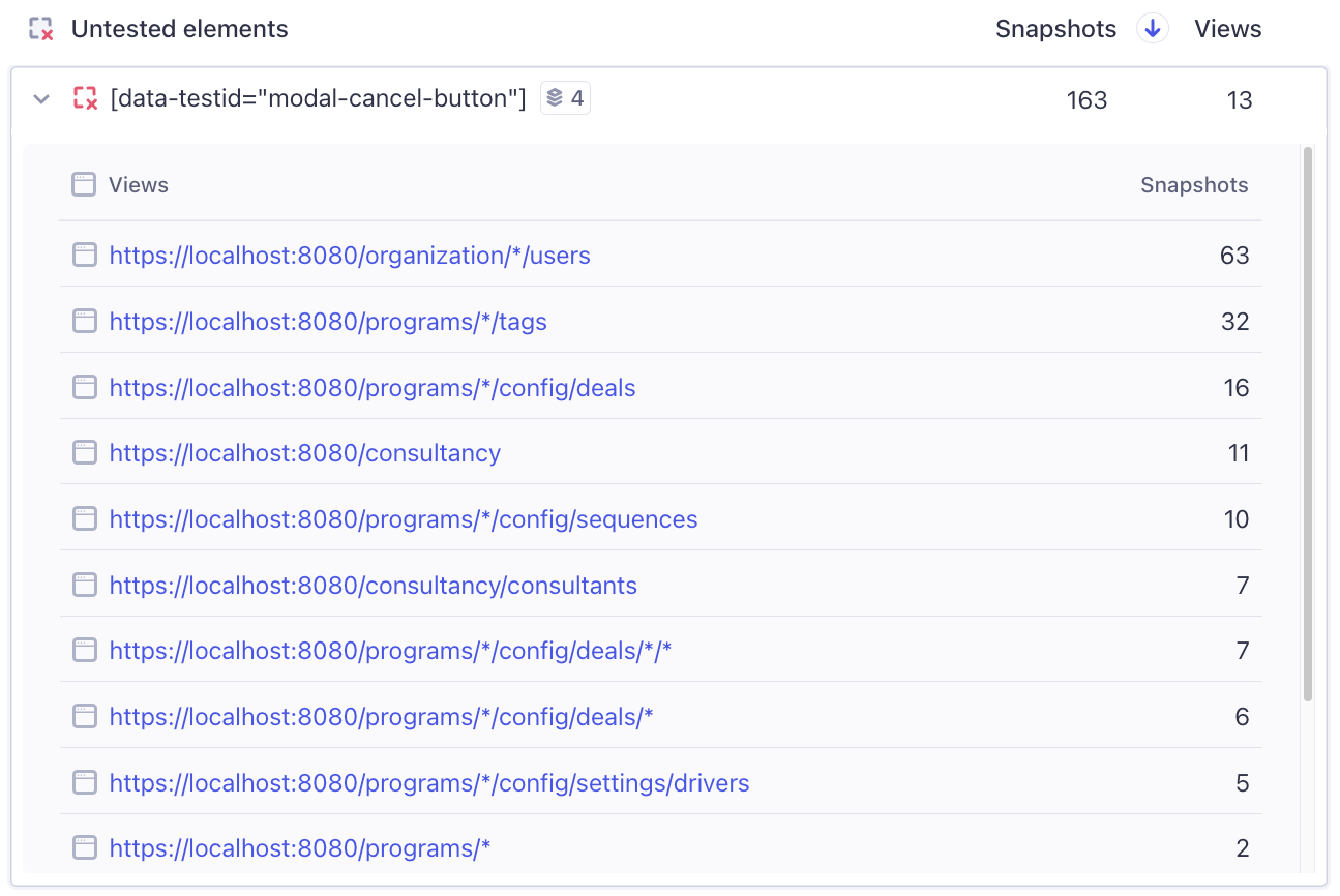
Use viewFilters to exclude pages that don't add coverage value (e.g., third-party domains, admin consoles, error routes). Identify candidates by scanning Views with zero tested elements and entries on Untested Links.
{
  "pattern": "*://*.mydomain.com/*",
  "include": true
},
{
  "pattern": "*",
  "include": false       // catch-all placed last
}
Remember: first match wins, so keep the ordering from specific to general or you’ll blank the report. If there is more than one team working in the same project, cross-check past runs and coordinate with other teams to avoid masking views they care about.
Element Identification
Once views are set, focus on elements. Start with Tested/Untested Tested sections in the sidebar and skim for these signals:
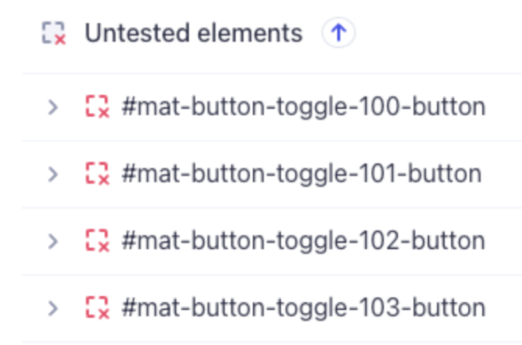
- Auto-generated selectors (e.g.,
#:r0:,.sc-7949ec68-0,#mat-input-13, UUIDs, etc.). - Repeated blocks of similarly named elements (see below)
If either pattern appears, you'll want to promote more meaningful attributes by using significantAttributes, filter out unstable ones with attributeFilters, and, where appropriate, group duplicates with elementGroups.
Next, sort by Snapshots and verify that high-frequency selectors truly map to one element per view. Drill into any selector that is suspicious, i.e., spans multiple views, to confirm.
significantAttributes
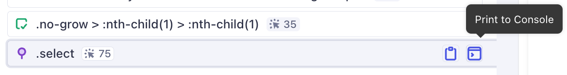
Having targeted a sample selector, click into it and see it in context in a View. Click through Snapshots or, better yet, use the Print to Console feature to look for stable and descriptive fields in Dev Tools.
In the example below, data-custom-id should be surfaced as a significantAttribute:

"significantAttributes": ["data-custom-id", "aria-label", "name", "title", "placeholder"]
If the DOM shows nothing useful, open Test Replay to see how the Cypress test targets the element, and extract the same attribute for UI Coverage.
Generally, React, Vue, Svelte, and Angular often emit unstable tokens related to popular component libraries or style systems (for example, .sc-7949ec68-0, #mat-button-toggle-123-button,, and other dynamic values that are different in every build of the application). Filter these out and, where possible, promote real identifiers instead.
A few things to note:
significantAttributesare applied in order, and the first matching attribute wins.- Changing
significantAttributescan split elements that used to share an attribute, and merge elements that now share the promoted attribute.
Verify by checking snapshot counts and view distribution after each change.
If the DOM truly lacks stable hooks (it happens), lobby for test-specific data-* attributes.
attributeFilters
When attributeFilters and significantAttributes work together you get stable, semantically correct element groups and cleaner coverage metrics. Use attributeFilters when auto-generated IDs or names either merge unrelated elements (submit buttons in different forms) or split identical ones (checkboxes with unique IDs).
// Best practice: one logical filter per object
{
  "attribute": "id|name|for|aria-.*",
  "value": ".*:r.*"                     // auto-generated attribute values
},
{
  "attribute": "class",
  "value": "sc-[0-9a-f]{8}-[0-9]"       // styled-components hashes
},
{
  "attribute": "data-.*",
  "value": "input"                     // overly broad selector
}
Guidelines:
- Scope broadly, value narrowly. List noisy attributes that are auto-generated in tandem (
id|name|for|aria-.*) but keep the value pattern specific (.*:r.*) to avoid collateral damage. - Keep filters readable. Multiple compact objects beat one unwieldy regex; future you (or another team) can toggle lines without deciphering a maze.
- Re-verify grouping. After adding a filter, check snapshot counts and views to ensure legitimate elements weren’t accidentally merged or hidden.
Grouping/Filtering
elementGroups
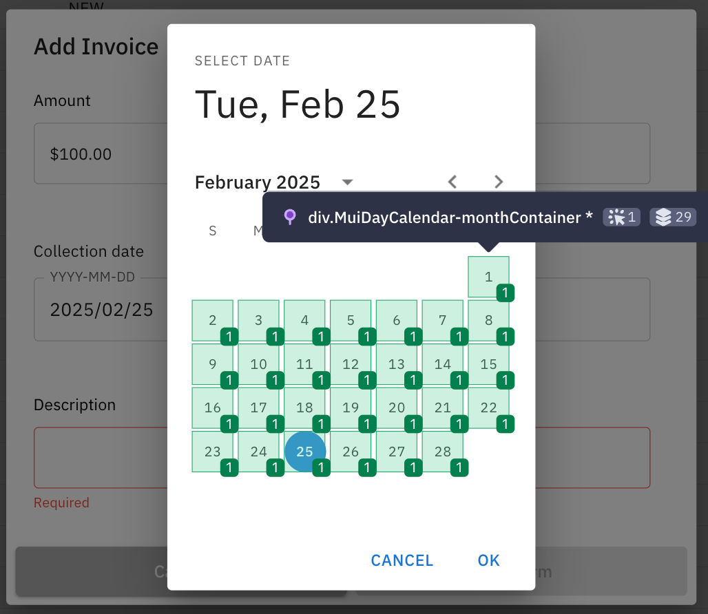
After attributes are stable, eliminate coverage score inaccuracies by explicitly grouping elements that serve the same purpose (carousel items, calendar days, dropdown items, radio options, etc.). When writing the selectors, don't worry about excluding irrelevant elements – UI Coverage will automatically do that for you.
Before grouping:
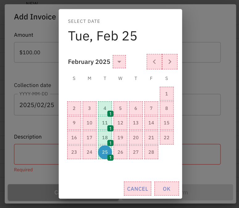
"elementGroups": [
  {
    "selector": "div.MuiDayCalendar-monthContainer *"
  }
]
This is an important technique to reflect your actual testing goals, when every item in the group is not expected to have its own test, but you want to test at least once.
After grouping:
Tips on inputs vs. labels
UI Coverage already merges an <input> with its <label> because users can click either. When you write a grouping rule, target the shared wrapper—or include both selectors—so you don’t create overlapping groups.
elementFilters
Use elementFilters to drop nodes that capture clicks but offer no real interaction such as container divs, overlays, shadow shields, etc. A common example: you click a sidebar item and both the menu entry and an overlaid wrapper appear as tested.
Filters run top-down, just like viewFilters and attributeFilters, so list the most specific selectors first and end with broad catch-alls.
Open Test Replay, confirm the selector Cypress asserted against, and filter out the wrapper:
"elementFilters": [
  { "selector": "div.submenu", "include": false}, // submenu wrapper
  { "selector": "div.menu", "include": false },  // menu wrapper
  { "selector": "div.sidebar", "include": false" }  // general fallback
]
elementFilters operate similar to viewFilters and attributeFilters in that the order of the filters applied matters. Start with specific and end in general.
This fine-tuning keeps reports focused on user-facing controls and hides elements that aren't relevant to the user journeys your tests cover.
elements
In rare cases, you may see the same element get recognized differently in different snapshots. Use the elements setting to unify them. If for whatever reason, this setting doesn't work, group said element using elementGroups as a workaround.
Configuration Checklist
For quick reference, here's a checklist to follow when configuring UI Coverage:
- ☐ Review and organize views
- ☐ Add viewFilters for irrelevant domains
- ☐ Promote custom significantAttributes
- ☐ Create attributeFilters for auto-generated and/or unstable values
- ☐ Group similar elements with elementGroups
- ☐ Filter non-interactive elements with elementFilters
- ☐ Unify inconsistently recognized elements
Wrapping Up
Effective UI Coverage configuration reveals a truer picture of what’s tested—and what isn’t. It often prompts adding clear data-* attributes: which is more readable, .2sSU9cz or [data-testid="submit-button"]? Thoughtful views, filters, and attribute rules raise the signal-to-noise ratio and yield trustworthy coverage scores. Enterprise customers can always reach out to their Technical Account Manager for deeper guidance.
Next Steps
If you haven't tried UI Coverage yet, request a trial to see for yourself what measuring test coverage looks like in your own projects.
Have you already integrated UI Coverage into your workflow? Share your questions, insights, or success stories with the Cypress community on Discord.
Happy exploring—and let us know what you discover!